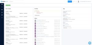
Over the past few weeks, our team has been hard at work completely redesigning karmaSpeaker’s user interface with you in mind.
Our goal in creating it was to make your experience with karmaSpeaker even more simple, effective, and user-friendly, and we’re excited to share it with you.
3 notable interface updates
The first thing you’ll notice with the new karmaSpeaker interface is a general revamp in the platform’s look and feel. You’ll also see that we’ve moved all of the tabs to the left side of the dashboard for a more streamlined and easy-to-use layout.
The new dashboard also features a cleaner and more modern esthetic font that you’ll find even more legible than it previously was.

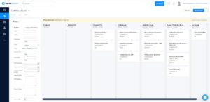
The next thing we did was update the Gigs screen so that your pipeline visual is even simpler. We also made it easier to scroll through individual pipeline stages. This is especially helpful for users who have many stages in their gig pipelines.

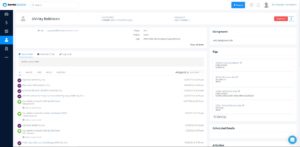
Finally, we’ve updated the Contacts screen so that your contacts’ social media accounts are now listed in the sidebar for easy access and can be removed from the gig list if needed.

How to get the new interface added to your account
If you’re interested in trying out the beta version of the new interface, send a message to our support team. They can implement it onto your account.
Final thought
Our priority is to continually refine karmaSpeaker to be the best possible tool to help you book more gigs and grow your speaking business. And direct feedback from our users is one of the best ways for us to make that happen.
So, once you’ve had a chance to test it, we’d love to hear your thoughts. If you’ve got feedback that you think could help improve karmaSpeaker, please let us know! We’ll do our best to put it into action.

